(the making of) Evil Comes Disguised
I’ve been so excited to share this image with you guys. When I picked the theme Wind for last week, I knew I wanted some major dress movement. I also knew it would take me forever to get the right “flicks”, which is why I ended up with around 300 pictures. Despite the heat and humidity, it was so much fun to shoot!
Here it is, image 10 for the 52 Week Project

And this is how I did it.
Started with the main image of the subject, and added all the extra shots to expand the frame.

Then I added all the “flicks” or “floofs” or whatever you wanna call them :p
I adjusted all the layers using curves to make them match the main image, removed the tire tracks and the water bottle, and painted the sky a greyish blue using a fuzzy brush. I also adjusted the fabric using warp.
Then I desaturated the skin and changed the color of the dress.
Added hair and changed the color of the dress again. I knew that once I move to colors and textures, I’d end up desaturating the whole image so I wanted to keep the blue a bit vibrant.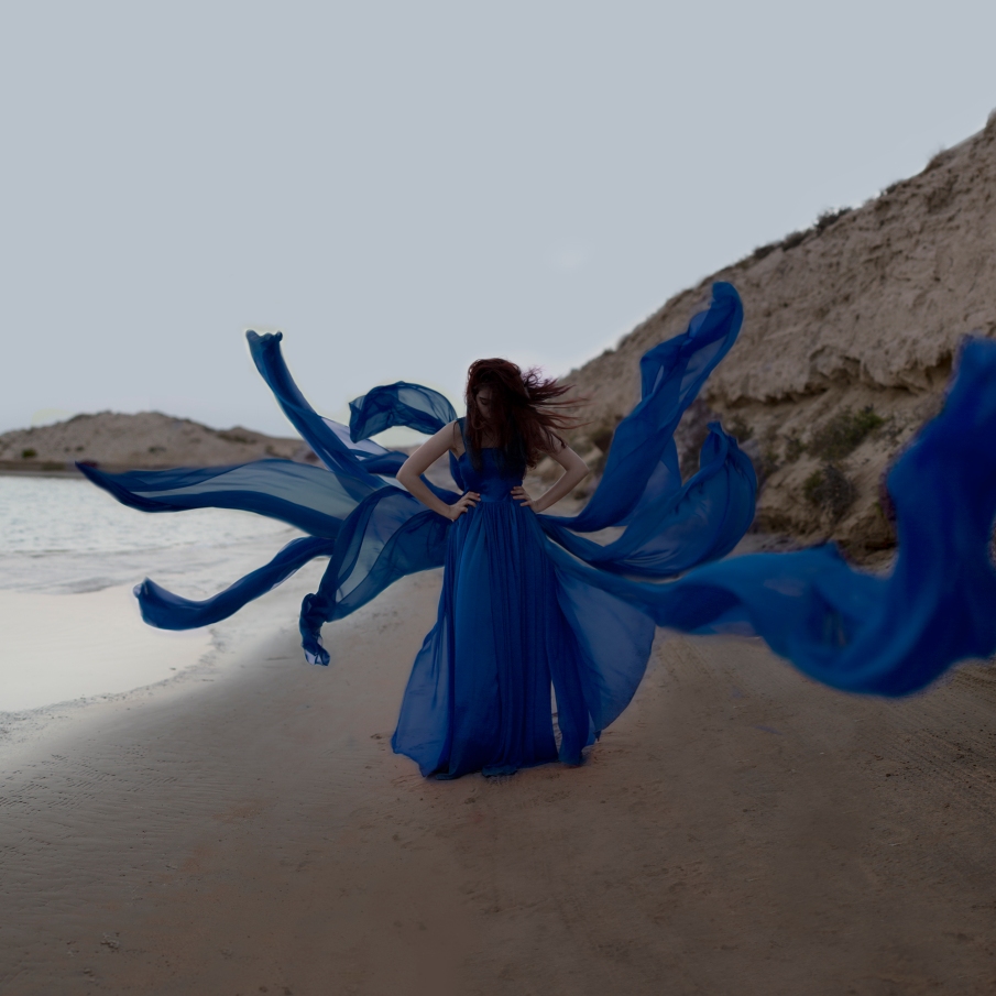
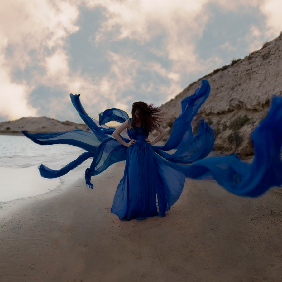
Then I added this sky
I adjusted the colors using curves and changed the blending mode to overlay at 79%. Then I duplicated that layer, flipped it, and lowered the opacity to 8%. I did that because the ground was wet so it was a little reflective and I felt like it would make it look a bit more real.
Added another sky

I adjusted it using curves to make it way more dramatic. Blending mode was Multiply at 85%. Then I did the same thing- duplicated, flipped, and changed the opacity to 35%.

Added a vignette using curves and desaturated at -26.
Added more yellows and reds using curves. Then using curves again, I added some contrast.
(you probably figured out by now that I do almost everything using curves)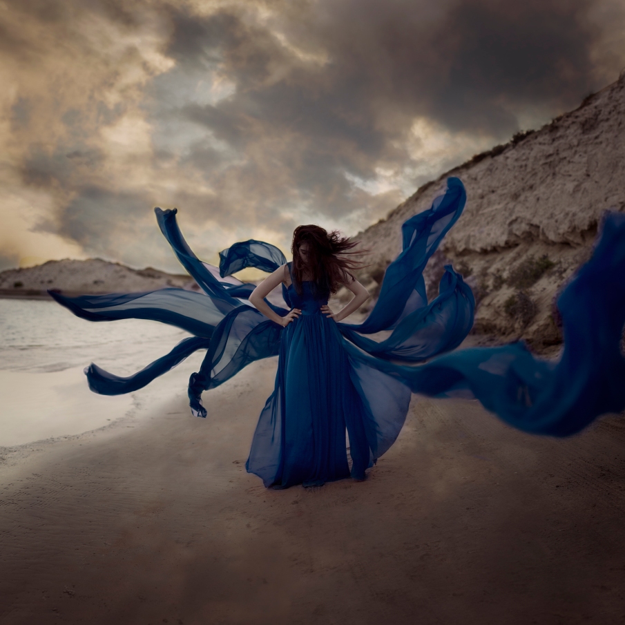
Added more vignette, and used selective color to make the blues pop.
Then I realized I really wanted to keep the dress red. When I thought of this, I knew for sure that I wanted it to be red. While editing, I wanted to experiment with color and fell in love with blue. Yup, I’m very indecisive. I absolutely love both colors.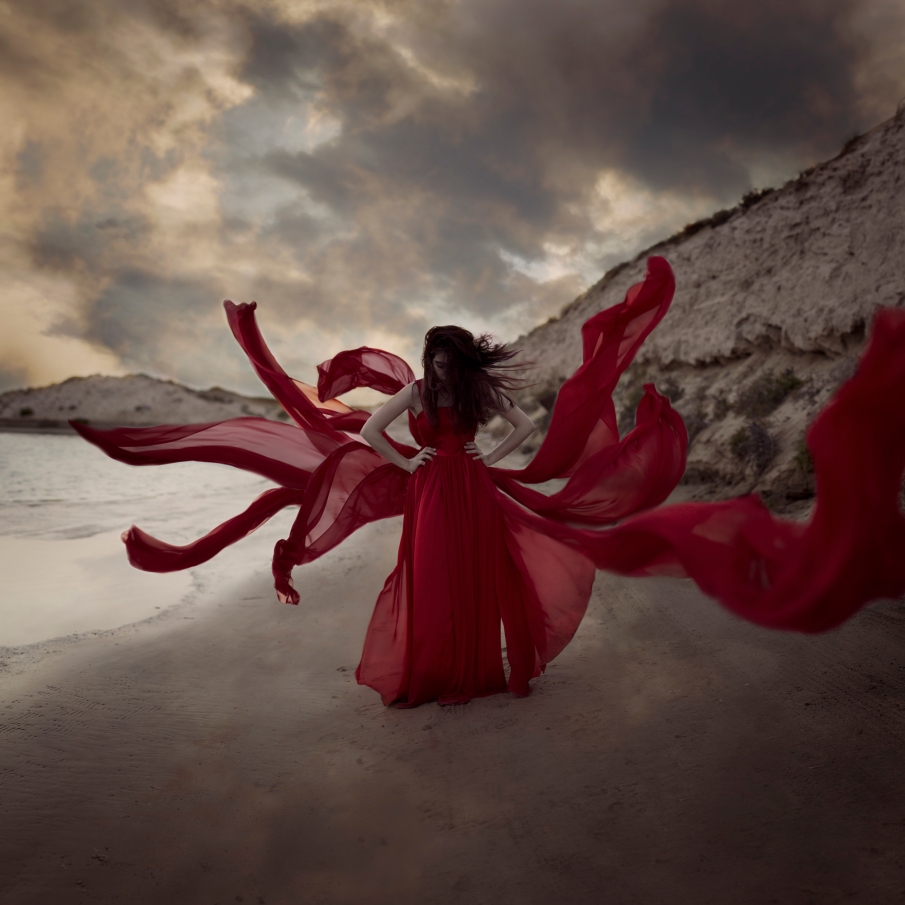
Added a texture and desaturated again at -19

Then I added another texture, vignette, and desaturated a little more at -11.

Using selective color, I made the reds a little darker. I also added a reduce noise filter and flipped the image and that’s it!
The reason I went back to red is that what I had in mind for this image was something about temptation, seduction, and evil. I never explain my images so I won’t go into much detail about that. I’ll admit that I’m a little sad leaving the blue behind. Yeah, it was a hard choice.
(I’m only half joking haha).
The skies I used are, again, by my friend TJ. And textures from Brooke Shaden’s blog.
So this week’s theme is: Bridges.
I maaaay have cheated this time and picked another theme (twice) because I didn’t like what I got.
(For those who don’t know, I wrote down a bunch of themes on tiny pieces of paper and every week I pick randomly).
Let’s see how this goes!
oh, I turn 23 tomorrow 😀
2014-2017 52 Week Project The Making Of 52 week project amani alshaali before and after challenge evil comes disguised fine art photographer fine art photography inspiration photography photography challenge photoshop photoshop edit the making of tutorial

Yeah!!! Now we’re talking! This one really rocks! Great job Amani 🙂
Lin Gun
LikeLike
Thank you so much! It’s good to hear from you 🙂 hope you’re doing well!
LikeLike
❤ Happy Birthday, Amani ❤
I wish you all the luck and happyness and passion in the world!
And your picture is amazing! Also I love it when you show the steps from the initial shots to the final image!
Thank you for sharing!
Have a wonderful day!
LikeLike
Aw, thank you so much Thea! ❤ sending you lots of hugs!
LikeLike
This is amazing!!!! Definitely think the red is better (though loved the blue as well) but the red just adds that touch of drama to it, love it! And happy birthday lady! You are still so young, and such a bright future awaits you!
LikeLike
That’s so sweet Natascha, thank you! ❤
It took me forever to decide which color to go with! Halfway through writing this post I changed my mind haha.
Hope you're having a great day!
LikeLike
Each new image I see of yours I end up saying ” Okay now this is my favorite” lol
Thank you so much for the mini tutorial, I have learnt ALOT! ❤ hehe can't wait to see what you do with the word " BRIDGES " =O
LikeLike
Aww Amina that’s so nice, thank you! ❤ and I'm glad you did!
I'm still trying to figure out what to do for Bridges but we shall see!
LikeLike